Rant: Braves Uniforms
-
Radbird

- There's someone in my head but it's not me
- Posts: 62390
- Joined: April 18 06, 5:08 pm
- Location: LF Bleachers @ Busch II
Re: Rant: Braves Uniforms
Not bad, but the helmet would look better if it had some gold in it. Maybe the M or outlining the M. I'm not a big fan of the monchromatic look.
-
JL21

- NPR & THT Contributor
- Posts: 36109
- Joined: April 18 06, 7:44 am
- Location: Chocolate City
Re: Rant: Braves Uniforms
A splash of gold or even white would've gone a long, long way with that thing. As it was, they looked like an XFL team or something.Transmogrified Tiger wrote:You're dead to me.JL21 wrote:Those were horrible. The uniform itself wasn't that bad but the helmets were ridiculous.
EDIT: and I see Rad agrees.
I don't really mind that so much. But I wish they'd pay proper homage to team histories in the case of these franchises that go so far back. That Giants alt. uniform is a great example of something that doesn't bug me at all.Spider John wrote:I'm sure you guys already know this, but part of the reason for the different unis is so the merchandising dept can have different styles of jersey and caps to sell to the fans.
-
Transmogrified Tiger
- Puppy Murderer
- Posts: 9323
- Joined: April 25 06, 6:07 pm
- Location: Across the River
Re: Rant: Braves Uniforms
I was mainly talking about the helmet. I could take or leave the jersey, but as a one time thing, the helmet was perfection.JL21 wrote:A splash of gold or even white would've gone a long, long way with that thing. As it was, they looked like an XFL team or something.Transmogrified Tiger wrote:You're dead to me.JL21 wrote:Those were horrible. The uniform itself wasn't that bad but the helmets were ridiculous.
-
stlouie_lipp

- Hallelujah Brother
- Posts: 13380
- Joined: April 17 06, 7:36 pm
Re: Rant: Braves Uniforms
I don't like 'em.
-
cardsfansince82
- is shooing asian children away from his fridge.
- Posts: 27776
- Joined: May 17 06, 10:23 pm
- Location: at the gettin' place
Re: Rant: Braves Uniforms
I like their hats as either a road or Sunday cap. The rest is garbage.
-
JL21
- NPR & THT Contributor
- Posts: 36109
- Joined: April 18 06, 7:44 am
- Location: Chocolate City
Re: Rant: Braves Uniforms
I've decided that the Jays have the dumbest uniform in all of baseball.
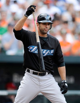
1. They're the BLUE Jays. This is a blue jay. So what are the Toronto Blue Jays' colors? Naturally, black and a tope-ish kind of color. Oh... and there, just in the teeniest amount, is a little bit of blue.
2. The "J" in "Jays" looks like a [expletive] "S" that's been melded together with a severed blue jay's head. So it's "Says".

3. And while we're on the topic, look at how stupidly deep the beveled effect is on the word "Jays" is. It murders legibility.
They look like an Arena Football League team or something. And this would be the easiest logo in the world to make. Riding the wave of Obamamania a few years ago, they easily could've used the navy blue/cyan/red color scheme because it a) actually is [expletive] blue like a blue jay, b) has the red that they need for the Canadian flag maple leaf and c) those were pretty hip/trendy colors for awhile there. It's not too late to get in on this. And yes, I know they're in Canada and shouldn't give a [expletive] about Obama. It doesn't make the scheme any less popular among fans in a sport that is predominantly American.
1. They're the BLUE Jays. This is a blue jay. So what are the Toronto Blue Jays' colors? Naturally, black and a tope-ish kind of color. Oh... and there, just in the teeniest amount, is a little bit of blue.
2. The "J" in "Jays" looks like a [expletive] "S" that's been melded together with a severed blue jay's head. So it's "Says".
3. And while we're on the topic, look at how stupidly deep the beveled effect is on the word "Jays" is. It murders legibility.
They look like an Arena Football League team or something. And this would be the easiest logo in the world to make. Riding the wave of Obamamania a few years ago, they easily could've used the navy blue/cyan/red color scheme because it a) actually is [expletive] blue like a blue jay, b) has the red that they need for the Canadian flag maple leaf and c) those were pretty hip/trendy colors for awhile there. It's not too late to get in on this. And yes, I know they're in Canada and shouldn't give a [expletive] about Obama. It doesn't make the scheme any less popular among fans in a sport that is predominantly American.
-
omaha_red

- Hall Of Famer
- Posts: 12963
- Joined: April 18 06, 7:53 am
- Location: toning it done
Re: Rant: Braves Uniforms

time for an update here.. a less stupid one
-
JL21
- NPR & THT Contributor
- Posts: 36109
- Joined: April 18 06, 7:44 am
- Location: Chocolate City
Re: Rant: Braves Uniforms
Yeah, that kind of screams "90's". I like their script logo, though- the one on their jerseys.

-
Radbird
- There's someone in my head but it's not me
- Posts: 62390
- Joined: April 18 06, 5:08 pm
- Location: LF Bleachers @ Busch II
Re: Rant: Braves Uniforms
I agree with JL's Blue Jay rant. They could have the AL equivalent of BOTB or at least something based on a realistic depiction of the bird.
Like when the Orioles went from this
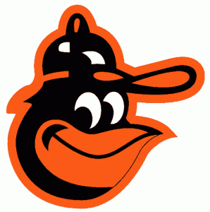
to this

Like when the Orioles went from this
to this
-
JL21
- NPR & THT Contributor
- Posts: 36109
- Joined: April 18 06, 7:44 am
- Location: Chocolate City
Re: Rant: Braves Uniforms
Both the O's and Cardinals were teams I thought of as ways the Jays could and should've modeled their uniforms after. I know they might want to be different and that's all well and good. But what they've got now is just out there.
Another thing I forgot to mention- the font for the numbers is ridiculous. Spoilered for size:
Another thing I forgot to mention- the font for the numbers is ridiculous. Spoilered for size:

